Classic Build Font: Assertive Display Type for Web Design
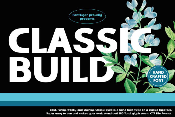
When designing high-impact digital experiences, the choice of typography often dictates the success of the visual hierarchy. Classic Build is a display font that commands attention through thick, assertive letterforms and a cool, structured aesthetic. For web designers and UI creators, this typeface offers more than just decorative appeal; it provides a functional anchor for hero sections, landing pages, and brand identities that require immediate recognition. Unlike delicate scripts or neutral sans serifs, Classic Build carries a weight that establishes authority and confidence the moment a user lands on a page.
In the context of modern web design, readability and scanning behavior are paramount. Users rarely read every word on a screen; they scan for key information. The bold geometry of Classic Build serves as an effective visual cue, guiding the eye toward critical conversion points. Whether you are building a SaaS dashboard, a boutique e-commerce store, or a personal portfolio, this font acts as a strategic tool to differentiate headings from body copy, ensuring that your most important messages stand out against competing visual noise.
Establishing Visual Hierarchy in Hero Sections
The primary strength of Classic Build lies in its ability to dominate hero sections without feeling cluttered. Its thick strokes maintain integrity even at large sizes, preventing the letterforms from appearing spindly or weak on high-resolution displays. When used for main headlines on a homepage or product launch page, the font creates a sense of stability and professionalism. This is particularly valuable for brands in construction, architecture, tech, or coaching niches where trust and solidity are core brand attributes.
However, using such an assertive display font requires careful layout management. Because the characters have significant visual mass, generous whitespace is essential to prevent the design from feeling heavy or oppressive. In responsive layouts, consider adjusting line-height and letter-spacing specifically for mobile viewports. While the font shines at large scales, tightening the tracking slightly on desktop can create a cohesive, logo-like lockup for headlines, while opening up the spacing on smaller screens ensures legibility remains intact.
Optimizing Readability Across Devices
Digital readability differs significantly from print. On screens, especially mobile devices, thick display fonts can sometimes bleed together or lose definition if not rendered correctly. Classic Build’s robust construction generally handles screen rendering well, but designers must still test across various environments. When placing white text over dark backgrounds—a common trend in modern UI design—the optical weight of the font can appear heavier due to light irradiation. You may need to select a slightly lighter weight or increase letter-spacing by 10-20px to compensate for this effect and maintain crisp edges.
For image overlays, ensure sufficient contrast ratios to meet accessibility standards. The bold nature of Classic Build makes it excellent for text placed over photography, provided there is a scrim or gradient overlay to separate the type from busy background elements. Avoid using this font for long-form body copy or navigation menus with limited space. Its personality is designed for short, punchy statements rather than extended reading. Reserve it for H1 and H2 tags, call-to-action buttons, and promotional banners, allowing a clean sans serif or readable serif to handle paragraphs and microcopy.
Strategic Font Pairing for Digital Products
A single font cannot carry an entire interface. To maximize the impact of Classic Build, pair it with typefaces that provide necessary contrast and utility. The goal is to let the display font perform as the "voice" of the brand while supporting fonts handle the "conversation." Here are three effective pairing strategies for web projects:
- Geometric Sans Serif: Pairing Classic Build with a geometric sans serif like Montserrat or Poppins reinforces a modern, structured aesthetic. The circular forms of the sans serif complement the assertive thickness of the display font, creating a cohesive look ideal for tech startups and digital agencies.
- Neutral Humanist Sans: For educational platforms or coaching sites, combine Classic Build with a humanist sans serif like Open Sans or Lato. The softer, more organic shapes of the body font balance the rigid confidence of the headers, making the content feel approachable and trustworthy.
- Editorial Serif: To create a sophisticated, magazine-style layout for lifestyle blogs or luxury e-commerce, use a high-contrast serif for subheadings and body text. The interplay between the bold display header and the refined serif creates a dynamic tension that feels premium and curated.
When implementing these pairings, establish a clear typographic scale. If Classic Build is set at 4rem for desktop H1s, your body copy should be sized proportionally (typically 1rem to 1.125rem) to maintain rhythm. Consistency in this scaling helps users intuitively understand the structure of your content, reducing cognitive load and improving engagement.
Applications in Branding and Conversion Layouts
Beyond standard website headers, Classic Build excels in conversion-focused assets. Its assertive tone makes it highly effective for call-to-action buttons and promotional badges. Words like "START," "JOIN," "BUY," or "LEARN" gain psychological weight when set in this typeface, potentially increasing click-through rates by signaling importance and urgency. In email marketing templates and social media graphics, the font ensures brand consistency across touchpoints, reinforcing identity even when users are off-site.
For online stores, Classic Build works exceptionally well for category titles and sale announcements. Its thickness allows it to remain legible even when scaled down for mobile grid views or sidebar filters. In digital planners and downloadable products, the font adds a tangible, printed quality that enhances the perceived value of the asset. Creative entrepreneurs selling courses or workshops can leverage this typeface to convey expertise and established authority, distinguishing their offerings from competitors using generic system fonts.
Technical Considerations and Licensing
Before integrating Classic Build into a live project, verify the technical specifications and licensing terms. Web performance is critical; ensure the font files are optimized for web delivery. WOFF2 format is currently the industry standard, offering superior compression compared to TTF or OTF files. Check if the foundry provides variable font versions, which allow for fine-tuned weight adjustments via CSS without loading multiple file requests. This flexibility is invaluable for responsive design, enabling seamless transitions between breakpoints.
Licensing is equally important for commercial web work. A desktop license typically covers static mockups and branding assets, but deploying the font on a live website usually requires a specific webfont license. Some licenses are tiered based on monthly pageviews or the number of domains. Always review the End User License Agreement (EULA) to ensure compliance, especially for client projects or template sales. If you are designing a WordPress theme, Shopify template, or Canva kit, confirm whether the license permits embedding or redistribution, as these often require extended commercial terms.
Finally, explore the included character sets and alternates. Many premium display fonts include stylistic alternates, ligatures, or multilingual support that can add unique flair to logos and custom graphics. Utilizing OpenType features allows you to customize the typeface for specific brand needs without compromising its core identity. By treating Classic Build as a comprehensive design system component rather than just a decorative element, you unlock its full potential to elevate digital experiences, strengthen brand recall, and drive meaningful user interaction.